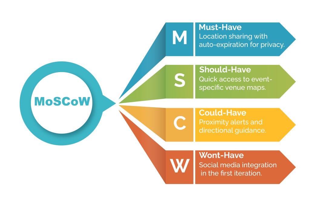
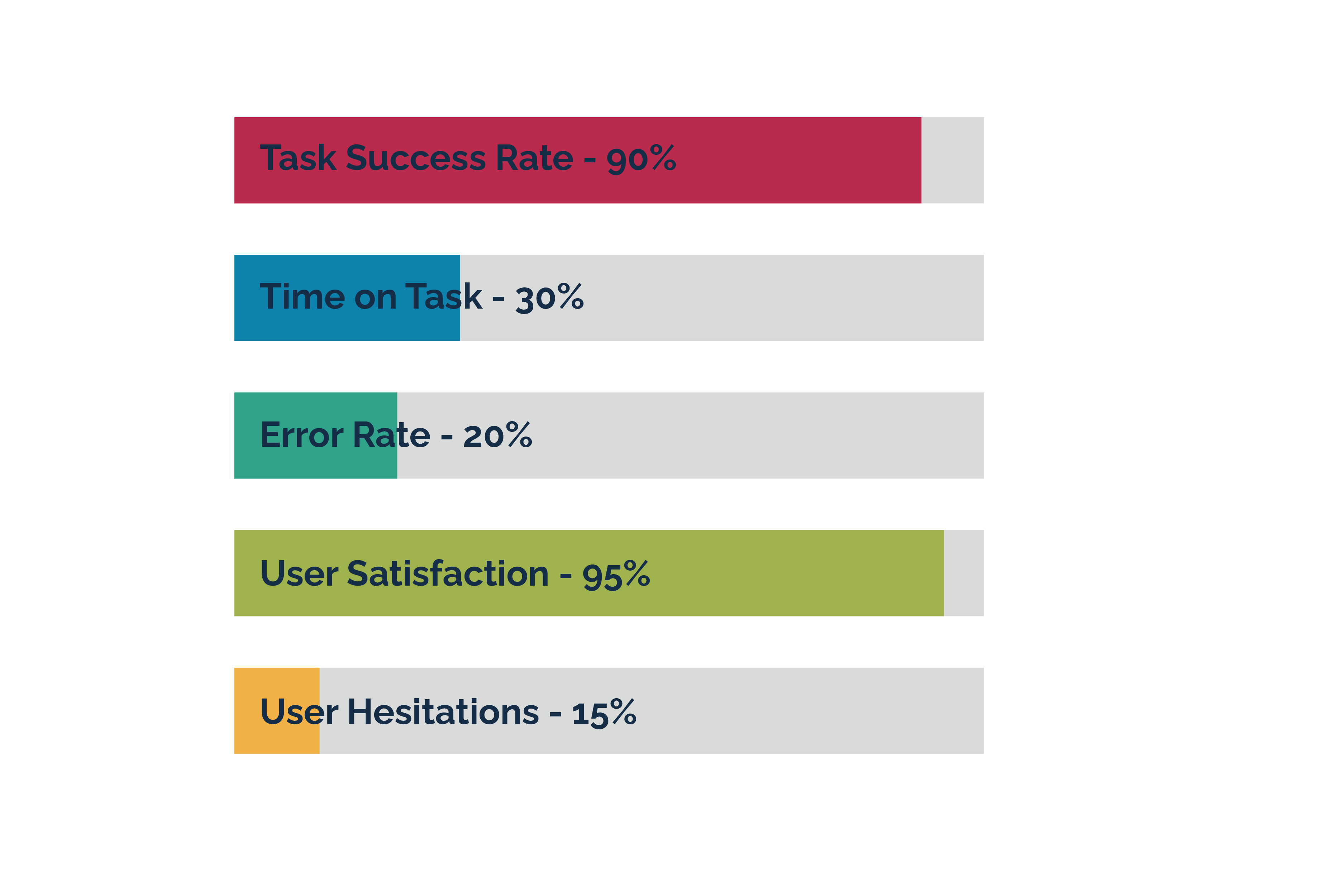
Case Study

CrowdLink

Img Img Img Img Img Img

Real Problems, Real Solutions

CrowdLink’s UX Design Journey

The Vision


The idea for CrowdLink was inspired by my personal experience. I attended a WWE event with my partner, only to find out later that my brother was there too—a missed connection that could have been avoided with better technology. This real-life scenario led me to explore how people struggle to stay connected at live events.


The Mission


We were tasked with designing a new product to solve this problem, focusing on creating a seamless, user-friendly experience for live event attendees to stay connected. We conducted user research through social media surveys, one-on-one interviews, and competitor analysis to gather a mix of quantitative and qualitative data.

Empathize & Explore

Discovering User Needs

Empathy Map

Conclusion

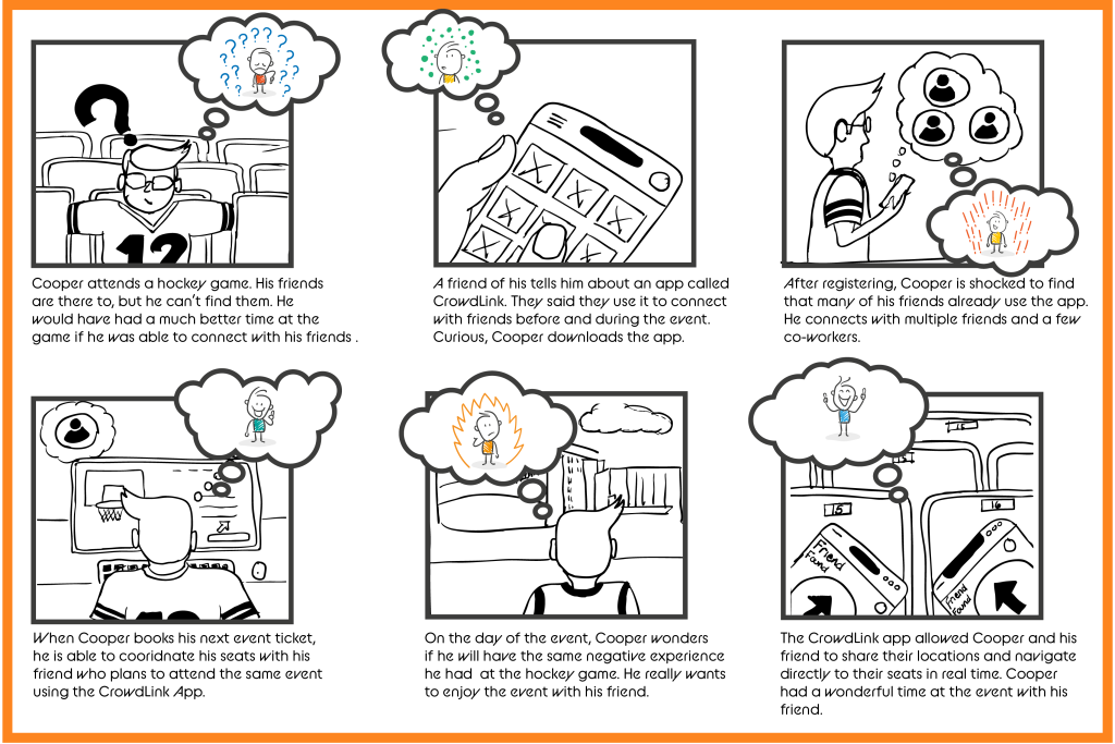
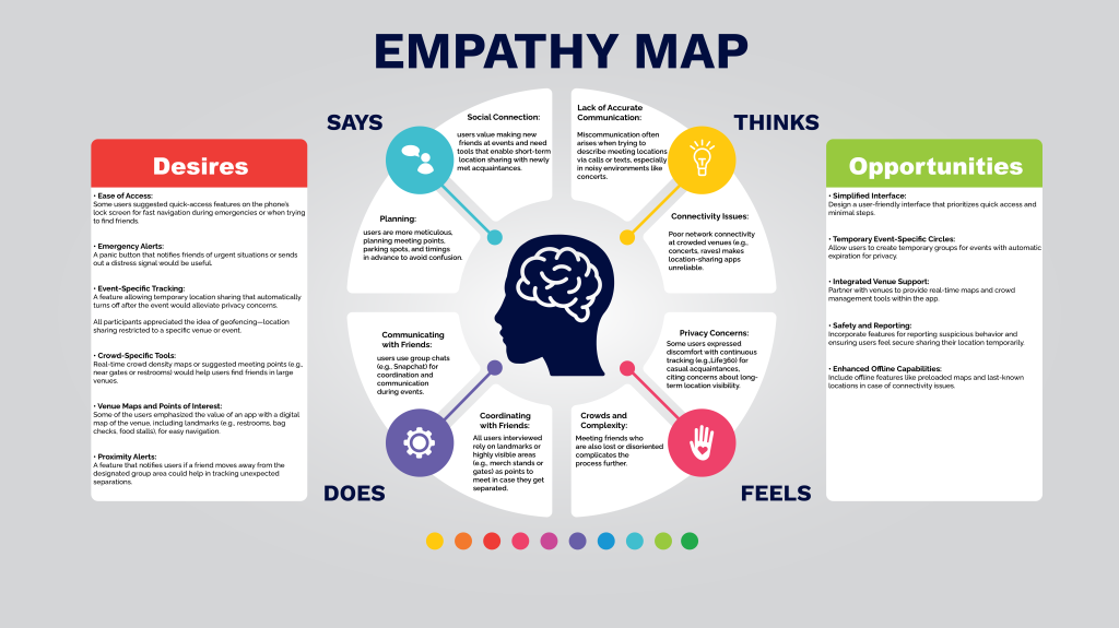
From these insights, we identified core user behaviors, pain points, and desires. These findings set the stage for defining the problem and uncovering opportunities for a user-centered solution. User revealed a significant need for a privacy-conscious, event-focused location-sharing app with seamless, real-time tracking and safety tools. By addressing pain points like connectivity issues, miscommunication, and privacy concerns, the app could provide a highly valuable service for users attending large events.

User Insights

Behavior

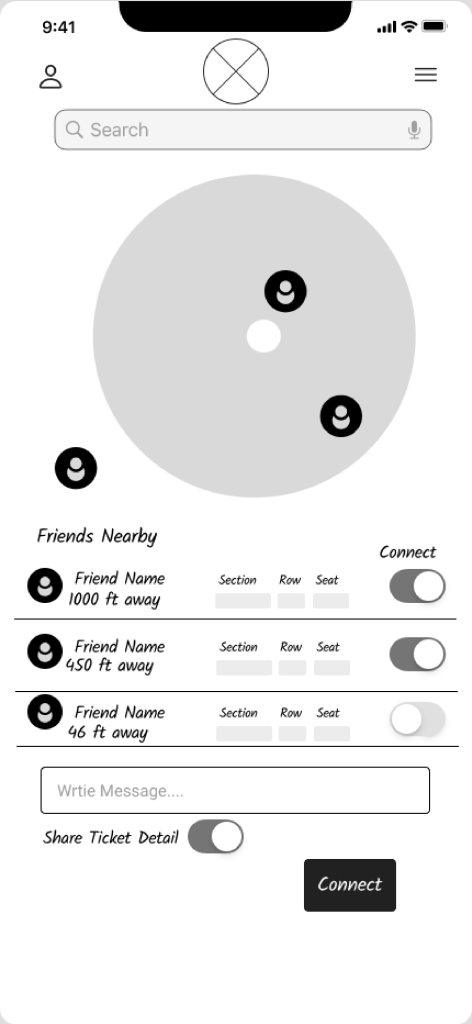
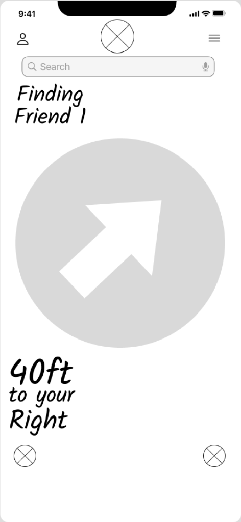
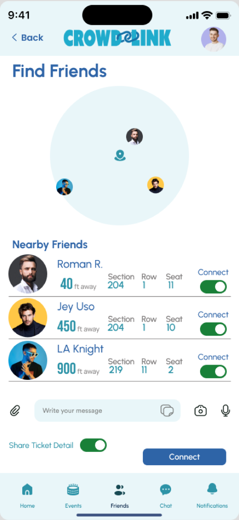
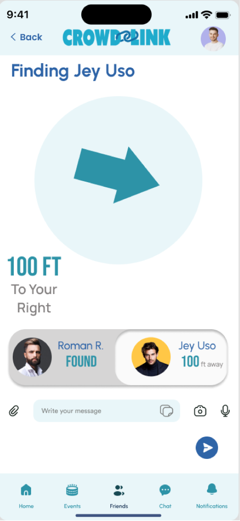
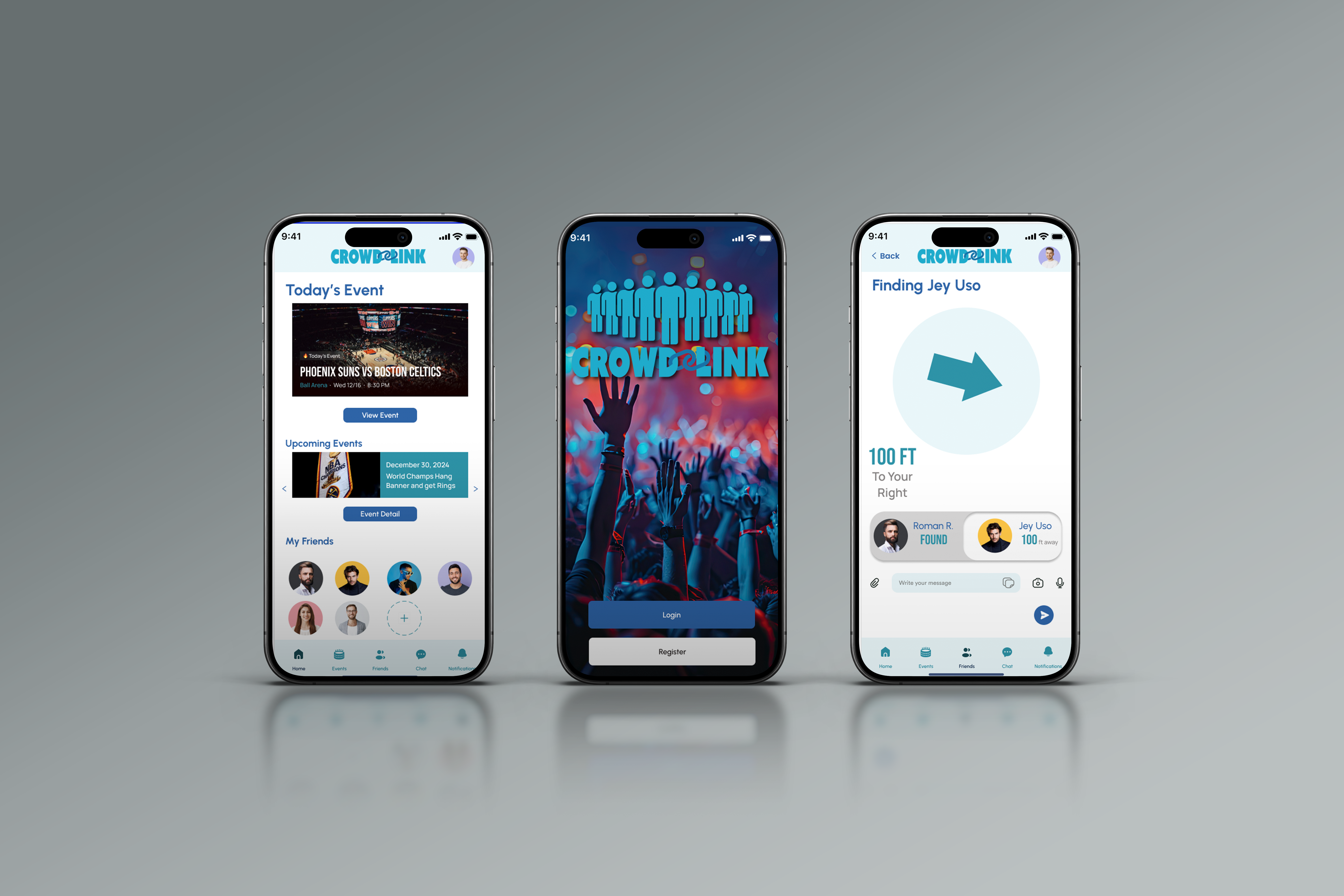
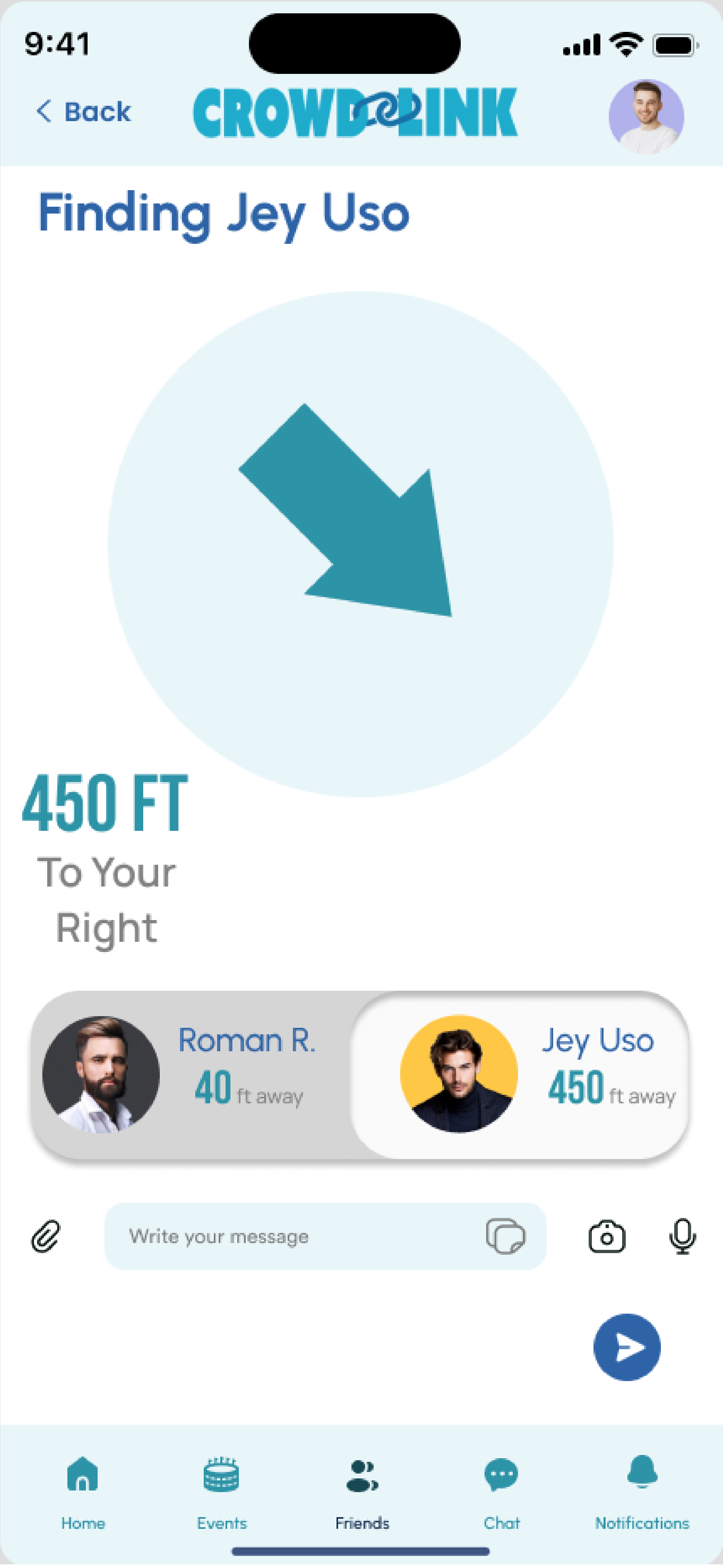
Users rely on landmarks to navigate crowded venues.

Management

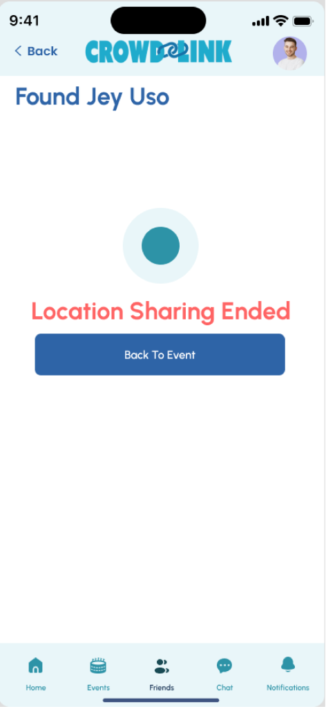
Privacy concerns and limited real-time location sharing.

Developing

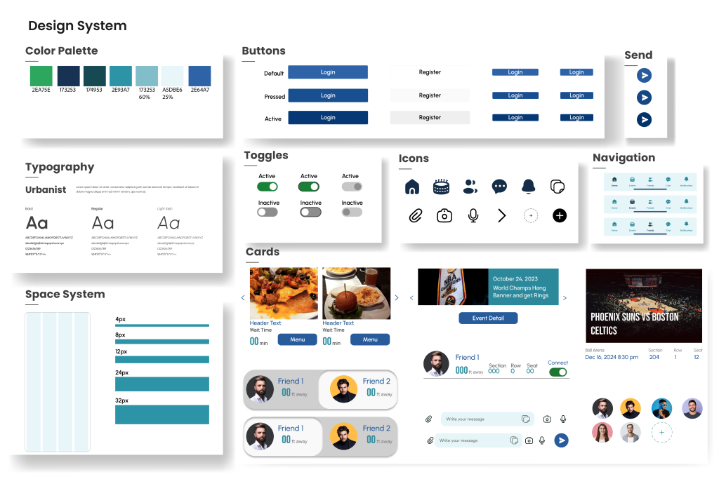
Simple interfaces, event-specific tools, and quick access to features.

Opportunities

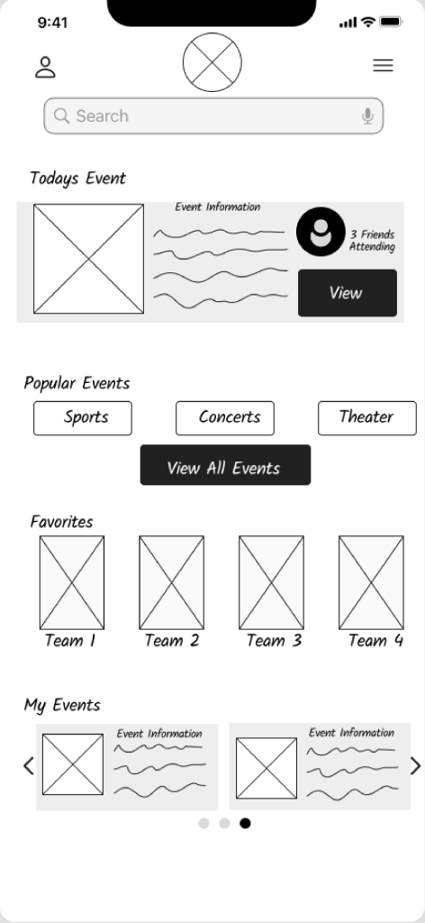
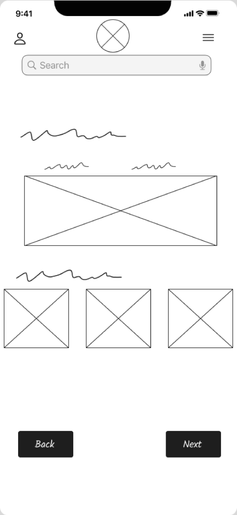
Simplified Interface

Prioritize quick access and minimal steps

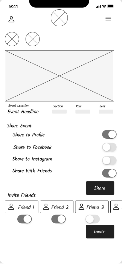
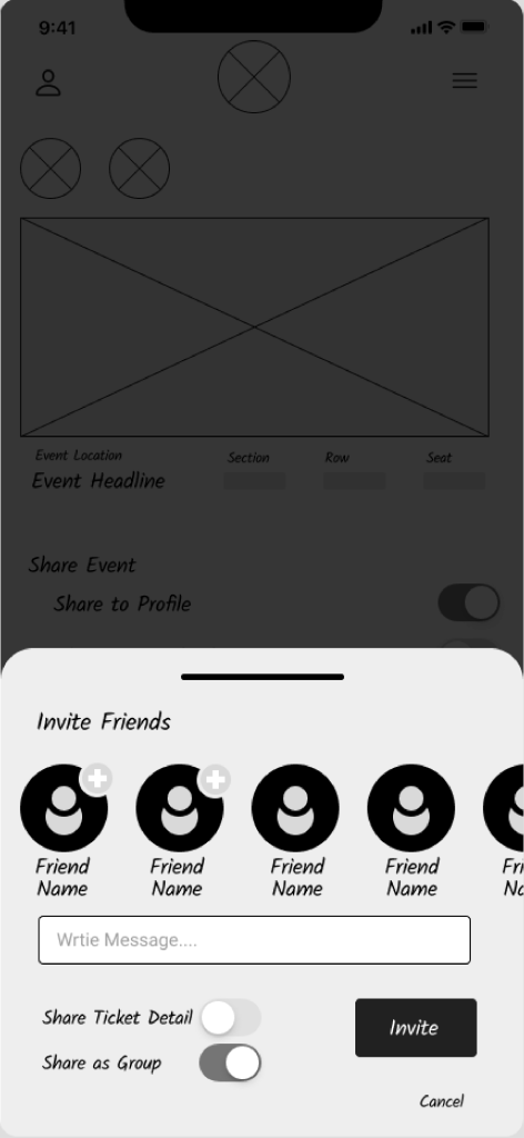
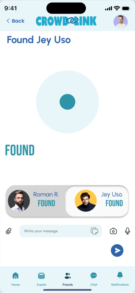
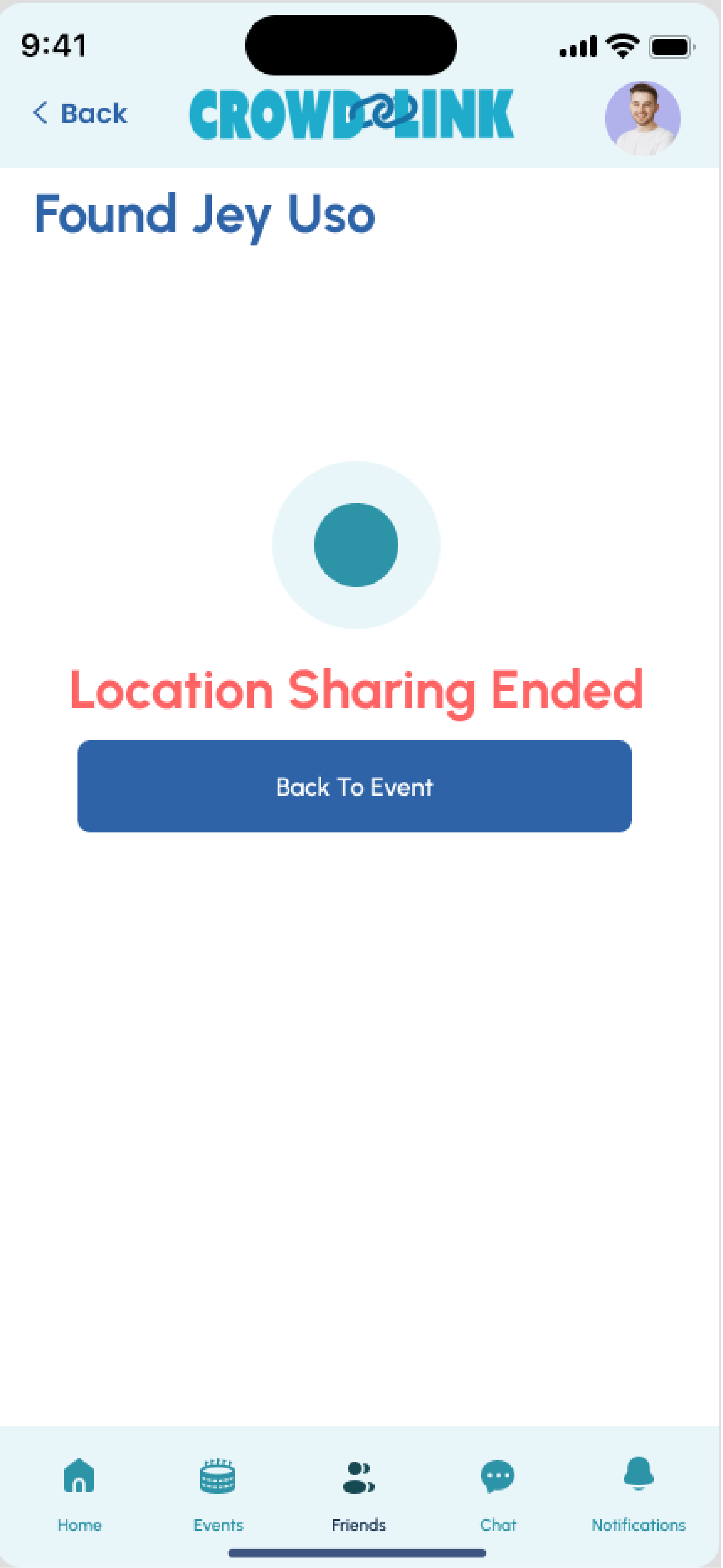
Temporary Event Circles

Location sharing with automatic expiration
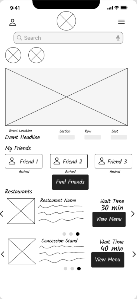
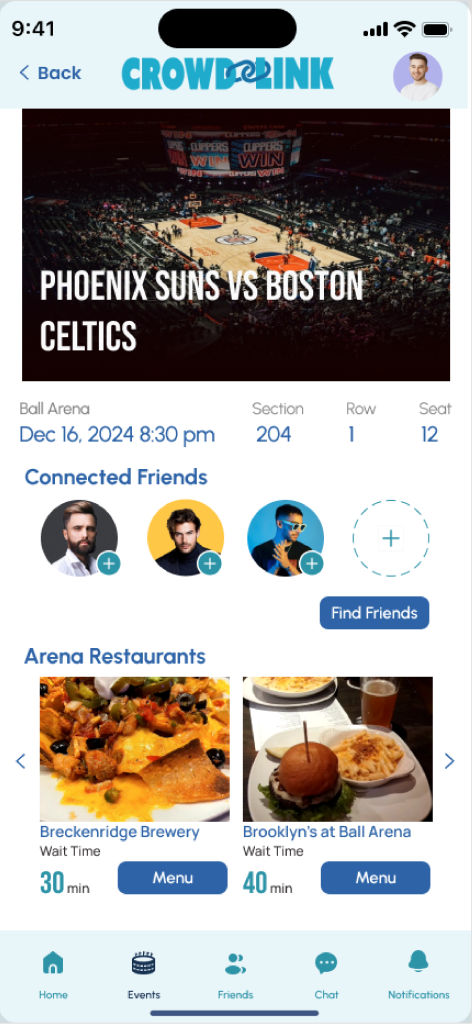
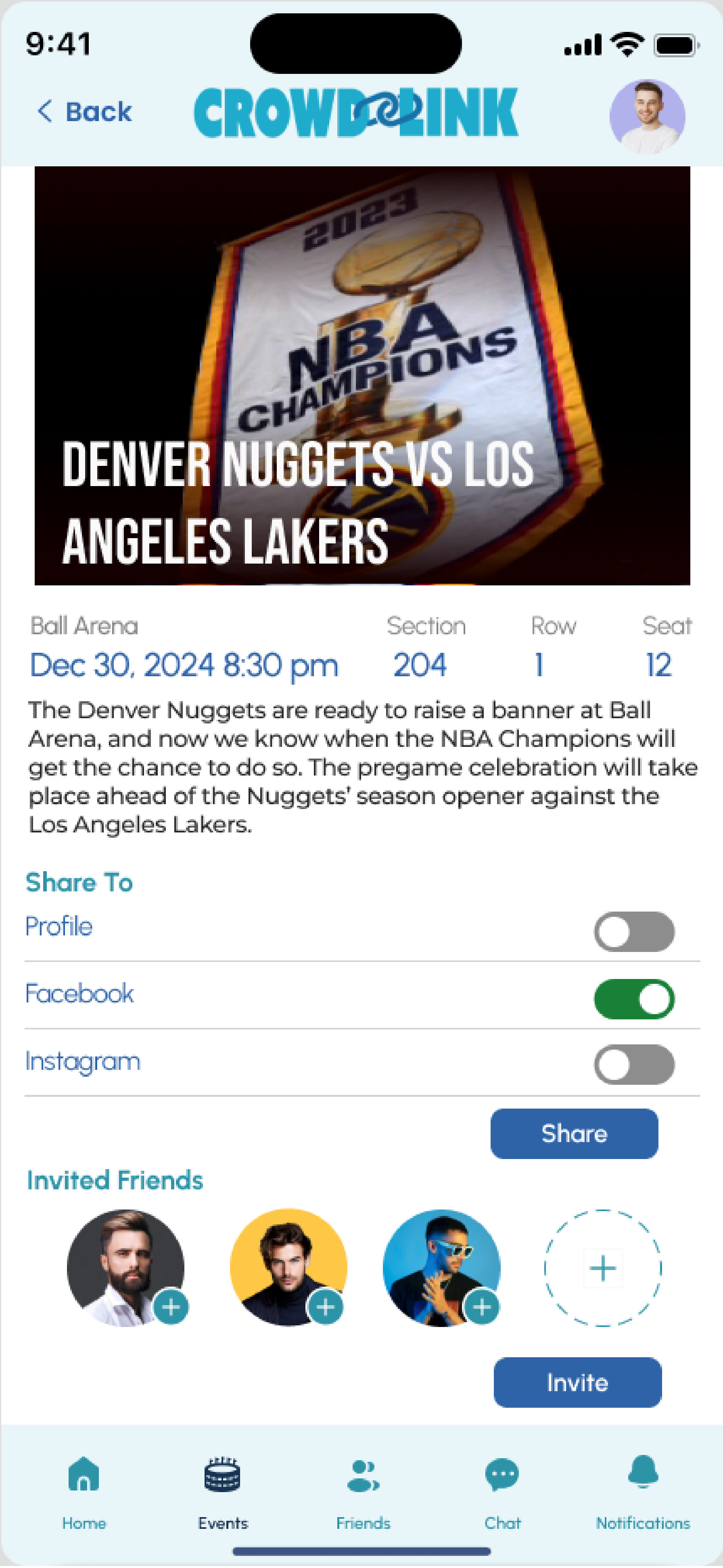
Venue Support

Share details about venue from within the app


A Key Insight

“The biggest frustration I face is being with people that don’t know their surroundings as well. So they are also lost, and I’m trying to find a person who is lost.”- Nani 20 years old

Defining the Problem

Turning Insights into Opportunities

Problem Statement

Meet Cooper, a regular concert and sports attendee who struggles to coordinate meetups with friends during events. Despite having digital tickets, there’s no easy way for Cooper to share his location or connect in real-time, leading to frustration and missed connections.


Our mission? Create an intuitive, privacy-focused solution to help users like Cooper seamlessly connect with friends during live events.

Ideating Solutions

Creativity Meets Feasibility

Affinity Diagram

We also storyboarded a user journey where Cooper discovers CrowdLink, connects with friends, and effortlessly navigates an event.

MoSCoW Matrix

Armed with research, we brainstormed features using a MoSCoW matrix to prioritize:

The Storyboard

We also storyboarded a user journey where Cooper discovers CrowdLink, connects with friends, and effortlessly navigates an event.

Prototyping

Bringing Ideas to Life

UX Hypothesis:

We believe that by providing a user-friendly app with event-specific details, temporary location sharing, real-time crowd density maps, and safety alert features , users will find it easier to locate friends at large events, reduce stress caused by connectivity  issues, and feel more secure while attending crowded venues.

The Breakdown:

Assumption: ​

Users struggle to find friends due to connectivity issues, poor communication, and large crowds.

Temporary location sharing:

 Event-specific sharing that expires automatically.

Real-time updates:

Crowd density maps and suggested meeting points.

Safety features:

Emergency alerts and privacy controls.

Expected Outcome:

These features will make finding friends more efficient and  enhance users' overall experience.

Wireframes

The evolution of CrowdLinks’s design through detailed wireframes, showcasing initial user flows, layout concepts, and iterative improvements that prioritize accessibility, clarity, and usability.

Don't Skip the Design System!

Our first attempt at prototyping taught us a valuable lesson: don’t skip the design system! We rushed into high-fidelity mockups without a solid foundation, resulting in spacing and alignment issues. We pivoted, developing a comprehensive design system with consistent components, color schemes, and typography.

Design System Highlights

Color Palette: Bold, event-themed colors for clarity and excitement.

Typography: Modern, readable fonts for easy navigation.

Components: Interactive buttons, cards, and event-specific templates.

Prototypes

With a solid system in place, our refined prototypes were more polished, consistent, and user-friendly.

Connecting with friends

1. On the day of the event user selected friends they would like to connect with
2. App shows distance between friends who have location sharing enabled

3. Directional arrows help user navigate to friends location

4. Indicator showing that friend has been located
5. Location sharing end automatically when friend is found

Planning Ahead

Example Questions:
1. App displays an upcoming event that you have already purchased ticket for.
2. Gives the option to share your interest in attending the event, or invite friends to attend with you
3. Share only the information you’d like to share 
4. Feedback to confirm the invite was sent successfully 

Testing & Iterating

Refining the Experience

Usability Testing

We conducted usability testing with clear goals:

Test Objectives

The primary objectives of the usability test is to:
1. Assess the ease of use and intuitiveness of key features, including:
○ Temporary location sharing.
○ Finding Friends
○ Sharing Ticket information
○ View event information
○ Explore dining options
2. Identify potential usability issues and areas of confusion.
3. Determine whether the app meets users’ needs for finding friends at large events.
4. Validate user satisfaction with the app’s overall experience.

Metrics for Evaluation

● Quantitative Metrics:
 ○ Task success rate (% of participants completing each task).
 ○ Time on task (average time taken to complete each task).
 ○ Error rate (number of errors or failed attempts during tasks).
● Qualitative Metrics:
 ○ User satisfaction ratings on a Likert scale (e.g., 1–5) for ease of use, design, and
usefulness.
 ○ Observations of user behavior (hesitations, confusion, workarounds).
 ○ Open-ended feedback from post-test interviews.

How we measured up

Key Metrics

Task Success Rate

90%

Time on task

reduced by 30% after iterations

Error Rate

Decreased significantly with clearer navigation.

Post-Test Survey

Example Questions:
1. How would you rate the overall ease of use of the app? (1 = very difficult, 5 = very easy)
2. Did the app help you achieve your goals effectively? Why or why not?
3. What feature did you find most helpful?
4. What improvements would you suggest for the app?

User Feedback

  • “The most helpful feature is telling you how distant your friend is and pointing you in their direction.”
  • “The most helpful feature is telling you how distant your friend is and pointing you in their direction.”

Enhancing Navigation

One critical suggestion was adding a "Return to Home" button after locating a friend, which we implemented immediately.

Final Prototype & Beyond

The Future of CrowdLink

Final Prototype

Our final prototype offers a streamlined experience:

What’s next

Looking Ahead

Enhanced Restaurant Menus

More detailed venue-based dining options.

Profile Customization

Create and view friend profiles

Meeting Spot Features

Set and confirm meetup points.

Project update

We’re now collaborating with developers to bring CrowdLink to life and refine our developer handoff skills. Leading this project as both its originator and project manager reinforced the power of user-centered design and the importance of iterative, feedback-driven improvements.

Skip to content