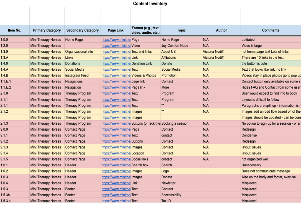
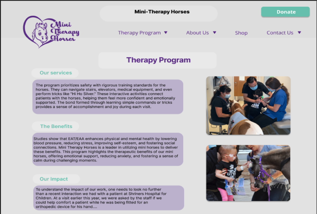
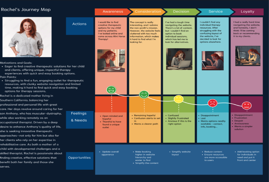
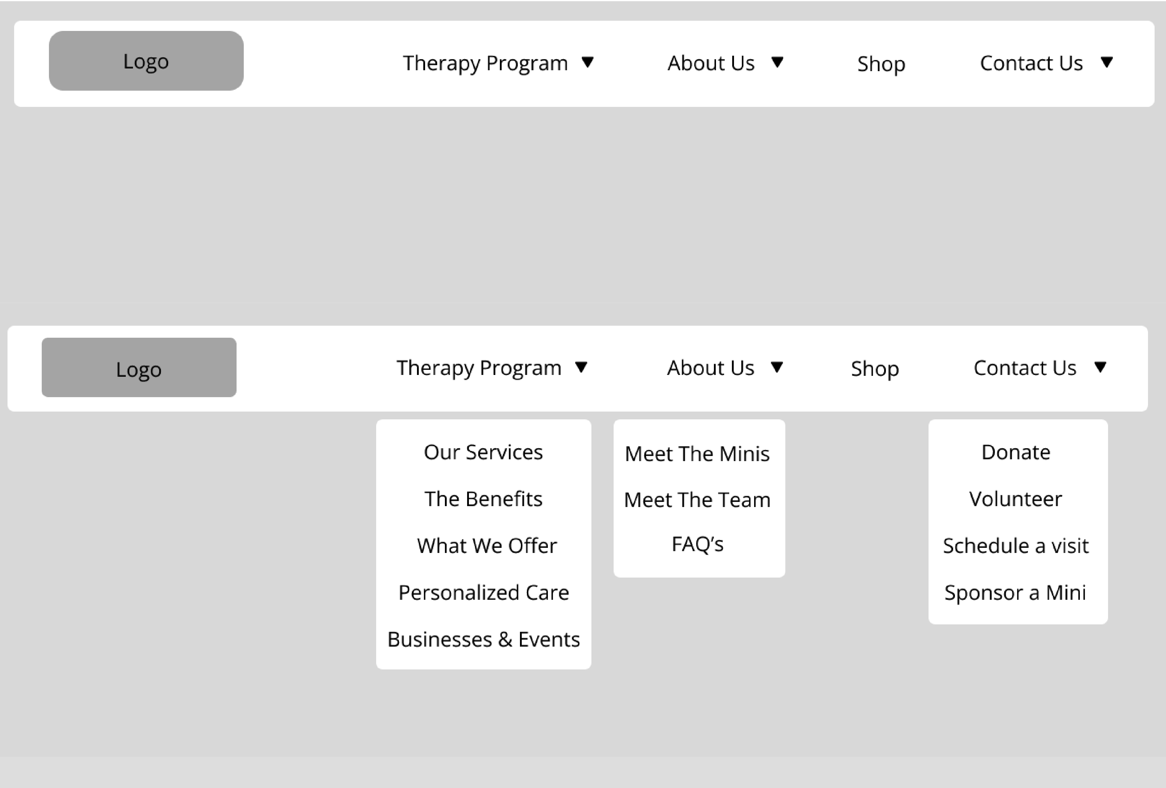
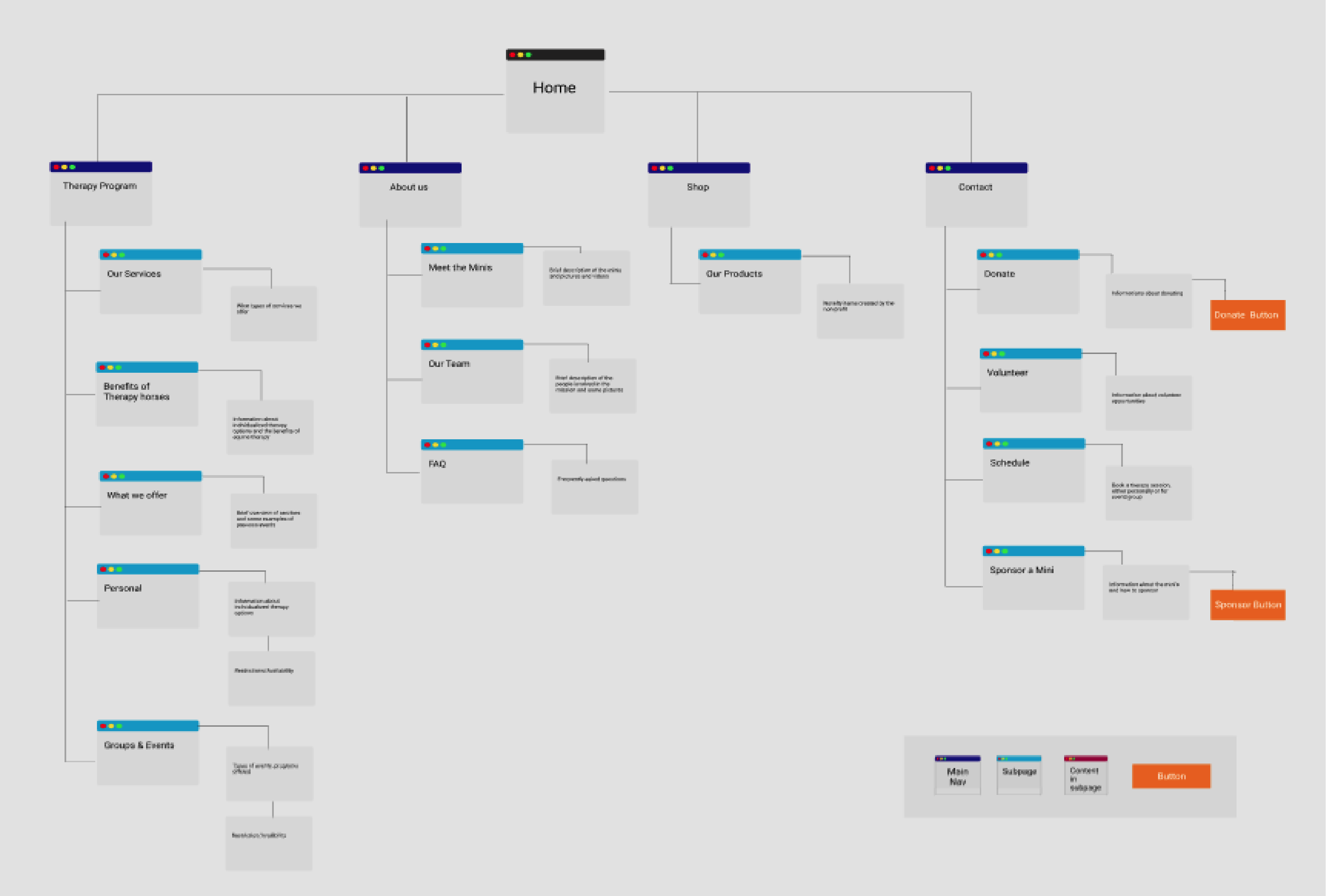
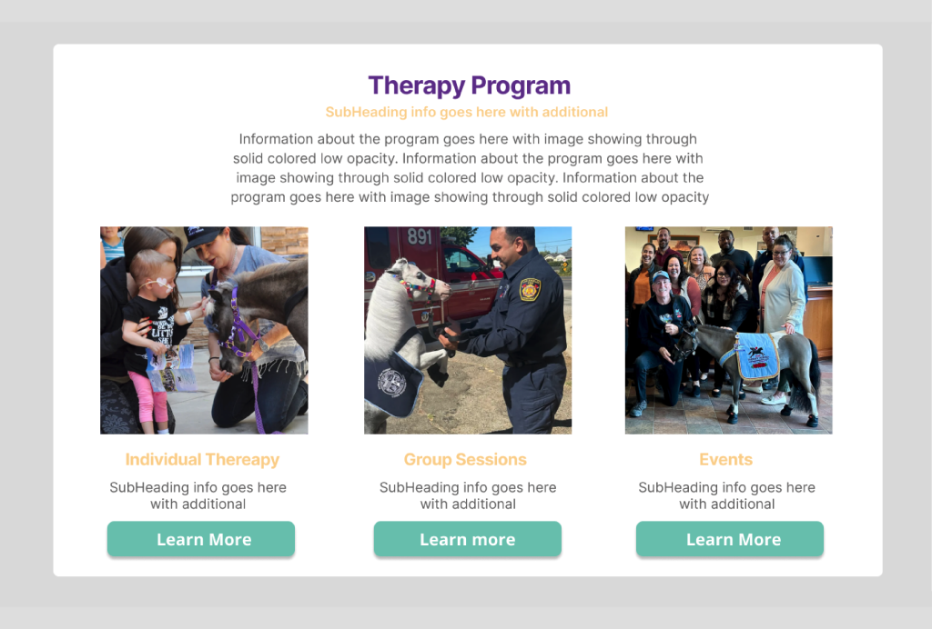
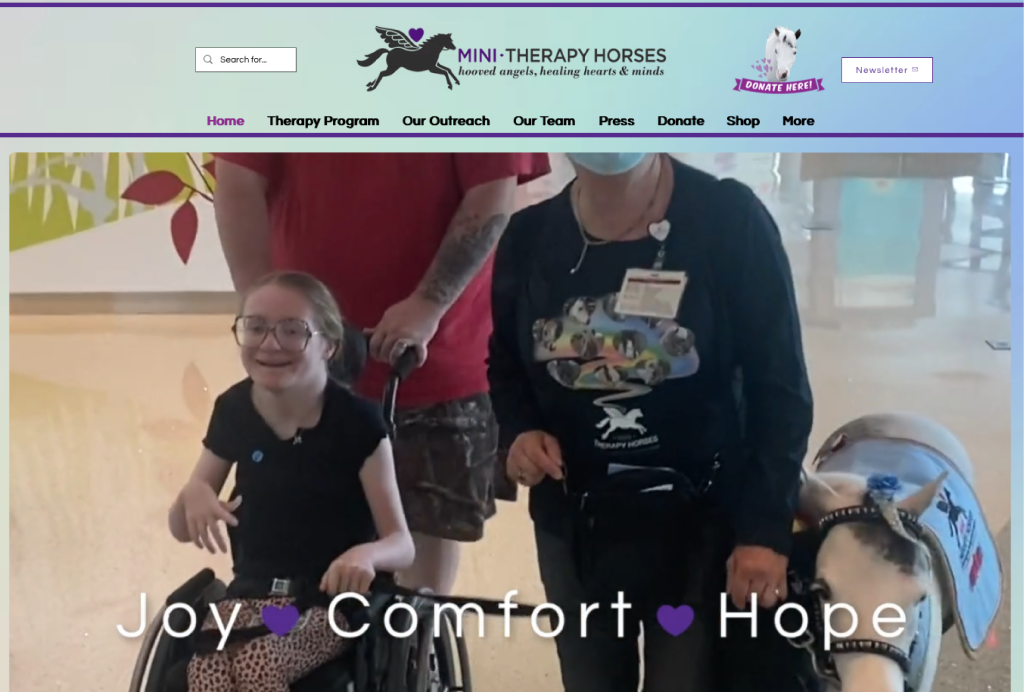
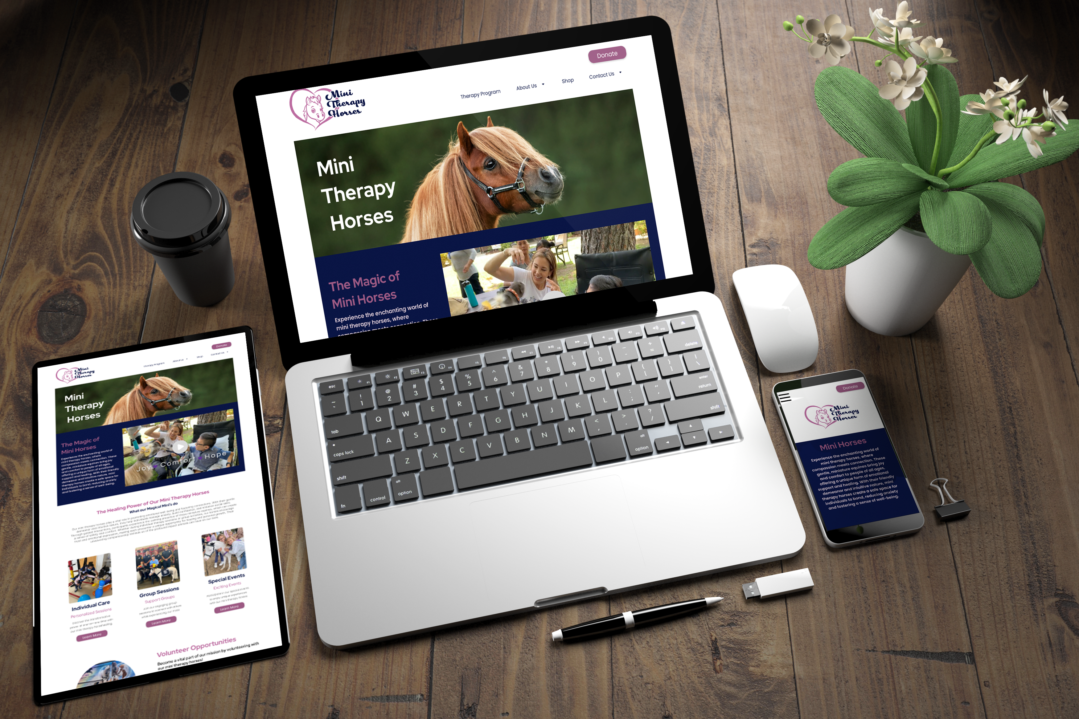
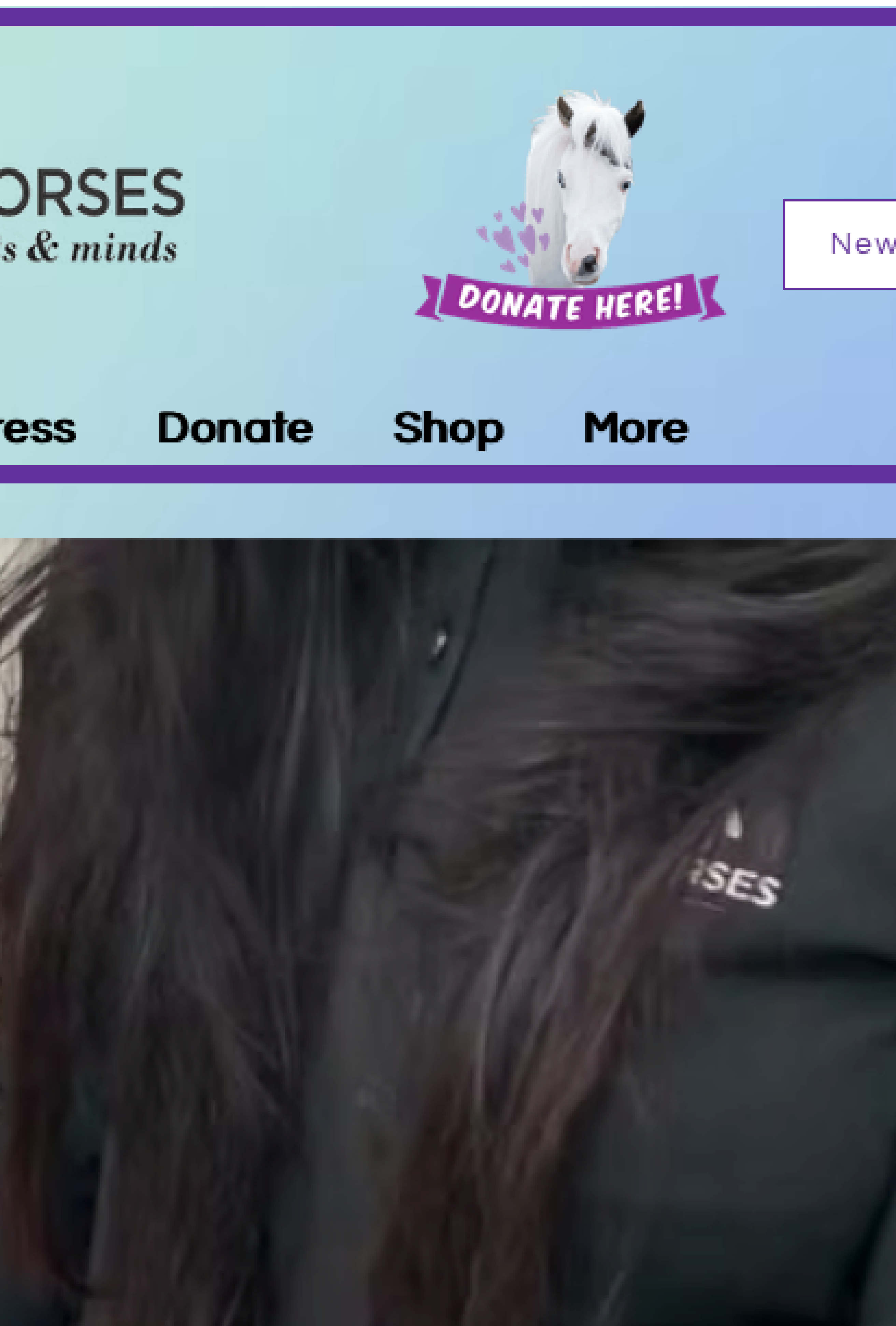
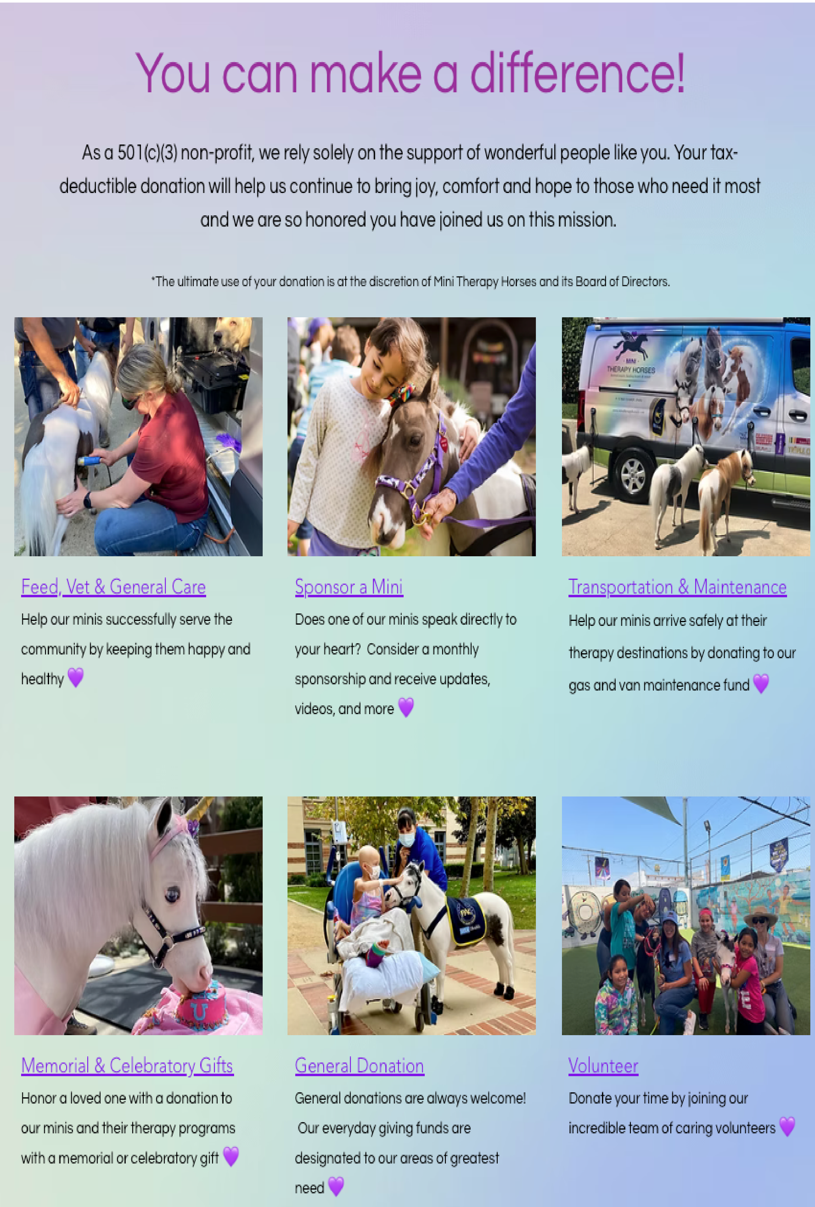
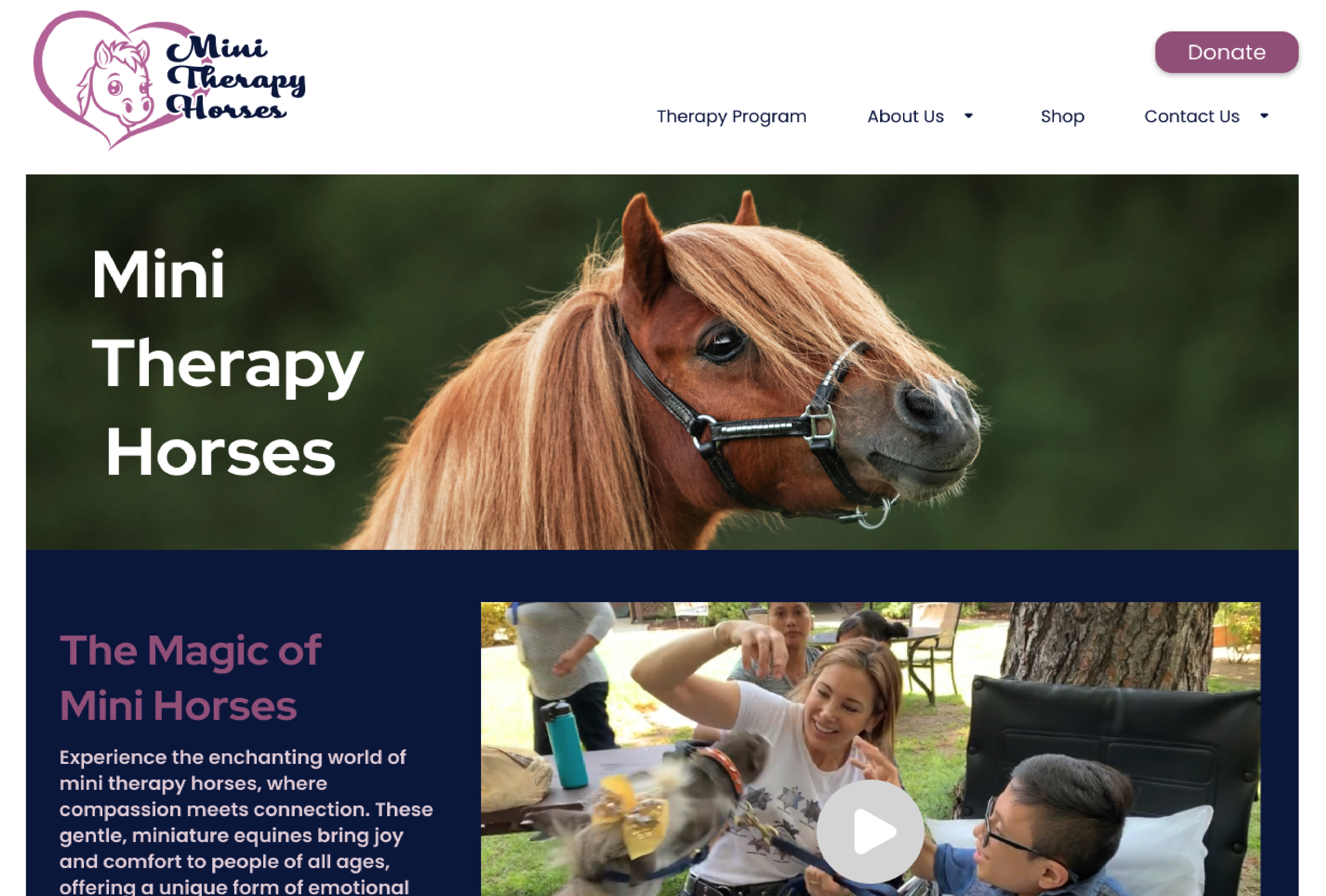
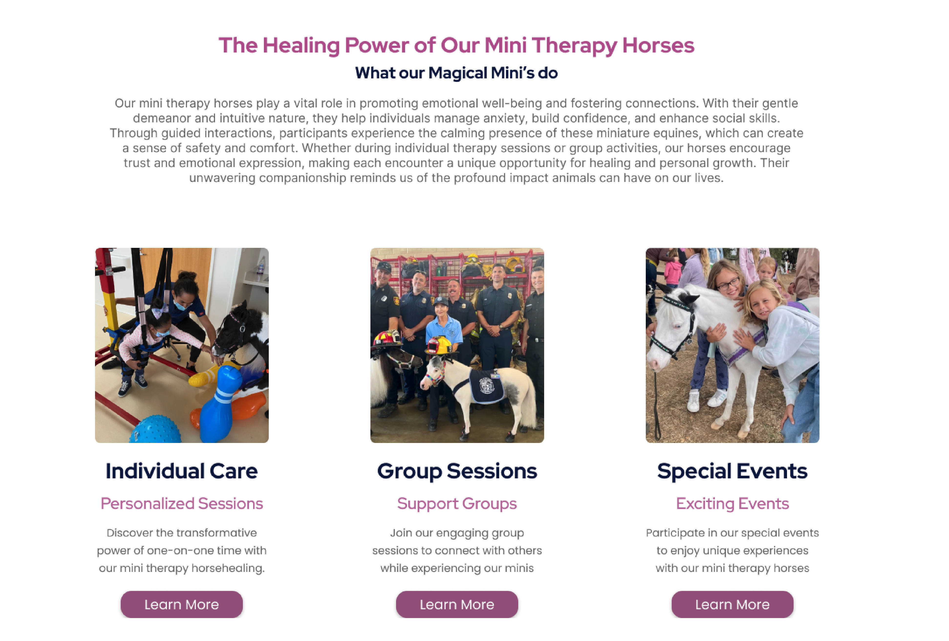
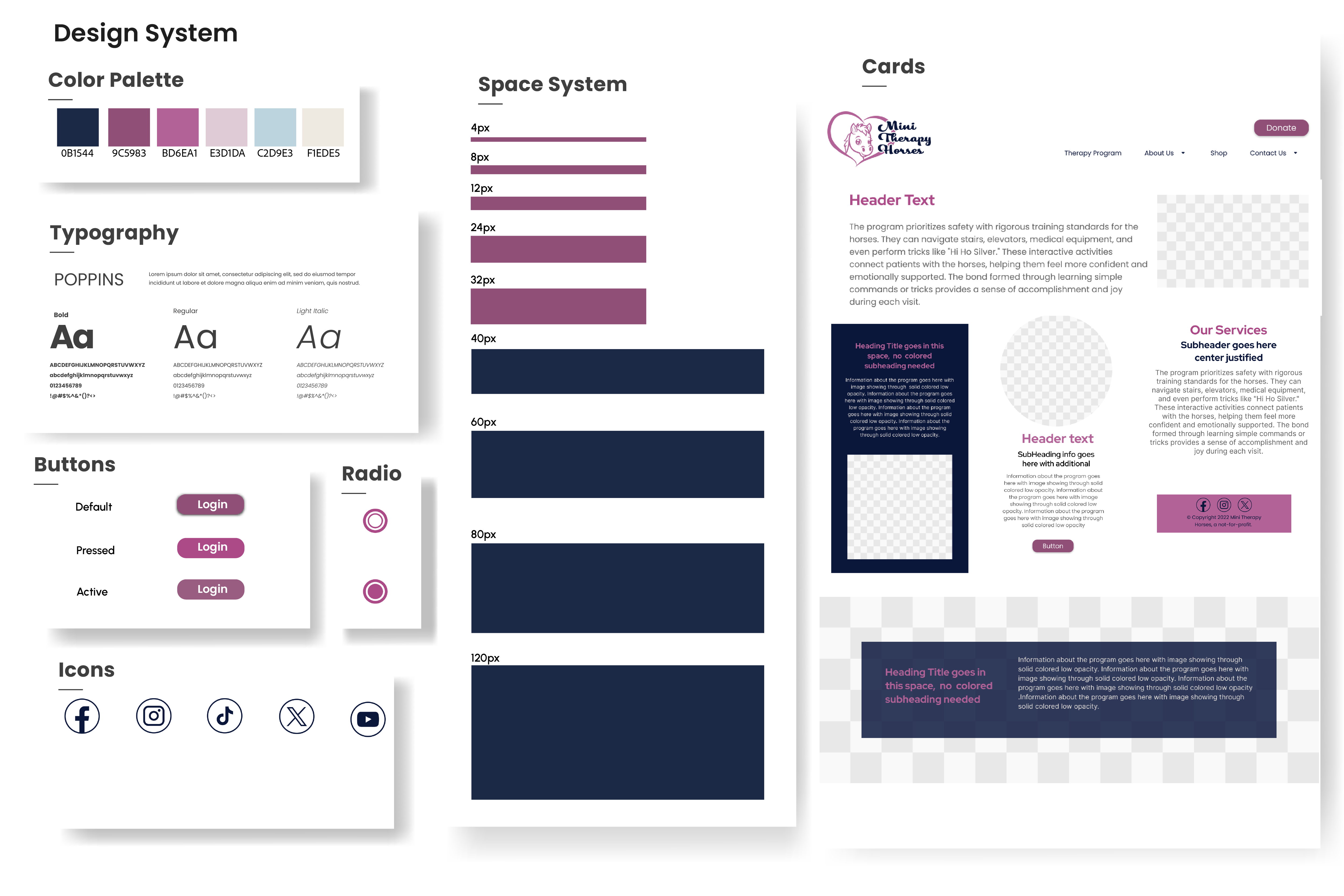
Project Overview: Mini Therapy Horses offers therapeutic experiences using miniature horses, bringing joy and healing to those in need. Our team, From Hoof to Heart, embarked on a UI redesign project to enhance the website’s user experience by addressing navigation, content organization, and overall usability.
Identify
Rachel “quote here”
Create a more intuitive structure.
Prioritize actionable items.
Introduce clear, accessible booking options.
Align aesthetics with the organization’s mission.
Due to a 2022 website rebuild, Mini Therapy Horses declined collaboration. Undeterred, we conducted an independent usability evaluation and redesign.
When redesigning the website, we initially decided to keep the same color scheme as the original site to maintain brand consistency. However, once we started building the mid-fidelity wireframe and applying the colors, it became clear that the existing palette had significant limitations.
The primary issue was the lack of contrast between the colors, which made it difficult to create a clear visual hierarchy and impaired readability. Text and interactive elements blended into the background, making it especially challenging for users with visual impairments to navigate the site.
Solution:
To address this, we went back to the drawing board and developed a new color scheme that adhered to WCAG (Web Content Accessibility Guidelines) standards. This involved: Selecting complementary colors with sufficient contrast to differentiate elements. Testing the new palette using tools like contrast checkers to ensure compliance with accessibility guidelines. Ensuring the new scheme still aligned with the brand’s identity by retaining key hues but adjusting their tones and saturation levels.
Results: Users preferred Prototype B for its clean layout and direct navigation to booking pages
Prototype A: Immediate access to booking options.
Prototype B: Streamlined session browsing with fewer clicks.